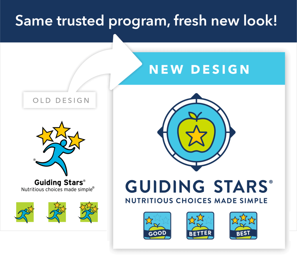
Over the next few months, you’ll start to notice a new design appearing everywhere you find Guiding Stars. Our new logo and nutrition guidance icons have been updated to tie more directly to nutrition and reinforce our “good,” “better,” or “best” messaging. We wanted to take some time to share our rationale behind the new look and feel, and what it represents for the Guiding Stars brand, clients, and for our community.
New Logo
After extensive research and design development, we are excited to introduce our new logo. The compass references the direction Guiding Stars gives, and the apple is a strong representation of nutrition. Our positive approach to communicating nutrition guidance is reinforced by the star and the color scheme is a nod to our original palette. Consumer testing validated that this graphic was well understood as a guide for nutritious foods.
Nutrition Guidance Icons
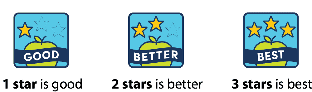
You’ll notice that our new icons are related to but different from the logo, so there’s no confusion between the two! Our 3-tier nutrition guidance icons now include the words “good,” “better,” or “best” to communicate that our positive approach only highlights nutritious choices. Outlined stars were also added to clarify that Guiding Stars are out of a possible total of three.
So, what’s next?
Although you’ll see a change in logo and nutrition guidance icons, after consumer testing, we kept our current tagline— “Nutritious choices made simple”— since it’s still at the heart of everything we do at Guiding Stars. We’re in the process of rolling out our new look, but you can expect to see our new designs on shelves, online and on packages soon! We are excited that this new branding will work so much harder for our clients helping them keep their commitments to building healthier communities.